
Logo Breakdown: The Mouse Mishap
- Hunter Sugg

- Dec 5, 2024
- 3 min read
Welcome to the first installment of my multi-part blog series where I critique real-world logos—taking a deep dive into design flaws, odd choices, and head-scratching decisions. I came up with this idea during my old daily commute. As I drove along the highway, I'd often find myself staring at all kinds of business logos and branding on vehicles. When I got stuck in standstill traffic (which happened often), I had the perfect opportunity to analyze these logos—and let me tell you, some of them were real head-turners.
To kick off the series, I’m starting with one of the most baffling logos I've ever encountered:
Accutech Pest Management
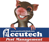
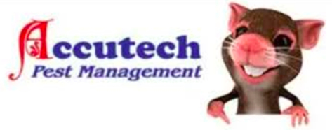
When I first drove behind one of their trucks, I literally laughed out loud at the sight of this logo. It features a bizarrely detailed cartoon mouse that left me both confused and entertained. This logo has so much going on, so let’s break it down into three key elements: the logomark, the wordmark, and the tagline.
The Logomark: The Mouse
As a pest management company, I can see the appeal of using a rodent as part of the logo. It makes sense, right? A simple cartoon mouse or perhaps a clever design incorporating mouse ears or a tail could work. But Accutech takes it to another level with a 3D-animated mouse, complete with fingers and teeth, and in a very specific pose. It’s... a lot.

The level of detail in this logomark makes it nearly impossible to use across different mediums. It’s too intricate, too animated, and frankly, it doesn't scale well. Can you envision this mouse on a hat, shirt pocket or a small business card? I visited the company’s website to check out some of their past ads, and let me just say, the inclusion of this mouse in various promotional materials is—well, cringe-worthy.
My favorite part is how the mouse is smiling and pointing directly at the company name—as if even the cartoon rodent is endorsing Accutech Pest Management. Almost like he's saying, "Trust me, I know pests, and these guys are the ones to call!" But instead of looking professional, it just adds to the overall weirdness.

The Wordmark: An Odd Pairing
If you ever wanted an example of two fonts that should never be paired together, this is it.
Why on earth would you choose a highly detailed letter for the first character of the wordmark, then follow it up with a thick, puffy Cooper Oldstyle font? The transition between the two feels jarring and disjointed.
It reminds me of the SpongeBob episode where he procrastinates on writing an essay and all he manages to write is the word "the" with an overly stylized "T." For a logo wordmark, it’s visually confusing and makes the logo feel inconsistent.
The first letter, which is overly detailed and a different color from the rest of the word, creates an unnecessary contrast that distracts from the overall design. The fonts don't complement each other, and the end result is a logo that feels unbalanced.
The Tagline: Legibility Issues

Now, let’s talk about the tagline. The italicized “Pest Management” text, paired with the web address in the vertical version of the logo, does not help the design. The italics make the tagline harder to read, and it feels like a third, unnecessary font has been added. It doesn’t flow with the rest of the design, and the decision to make the website so small and place it above the company name is just... odd. Website addresses should be clearly separated from the logo, not crammed into a space where they distract from the overall visual hierarchy.
The Positive: It Gets Your Attention
Okay, let’s end on a positive note: this logo does grab your attention. If I weren’t a designer, I’d probably think the mouse is cute and funny—definitely memorable, which is a plus in some contexts. But as a professional logo, it falls short in terms of clarity, consistency, and scalability.
Final Thoughts: A Design Overhaul Needed
Overall, the Accutech Pest Management logo could definitely use a makeover. Simplifying the fonts and replacing the overly detailed animated mouse with a clean, 2D illustration would immediately make the logo feel more professional and polished. A more minimalistic approach could help convey the expertise and trustworthiness that a pest management company should aim for.
Note: This critique is purely a design analysis and is in no way a reflection of the quality of services provided by Accutech Pest Management. This post is simply my take as a graphic designer on the visual aspects of their logo. I have no knowledge or opinion on the company's pest removal services, which may very well be excellent.
Thanks for reading! I’ll be posting more logo critiques soon. In the meantime, let me know your thoughts on this design, or if you’ve spotted any other bad logos that deserve a deep dive!


Komentar